Pump House Regional Arts Center
Social media graphics, flyers, & brochures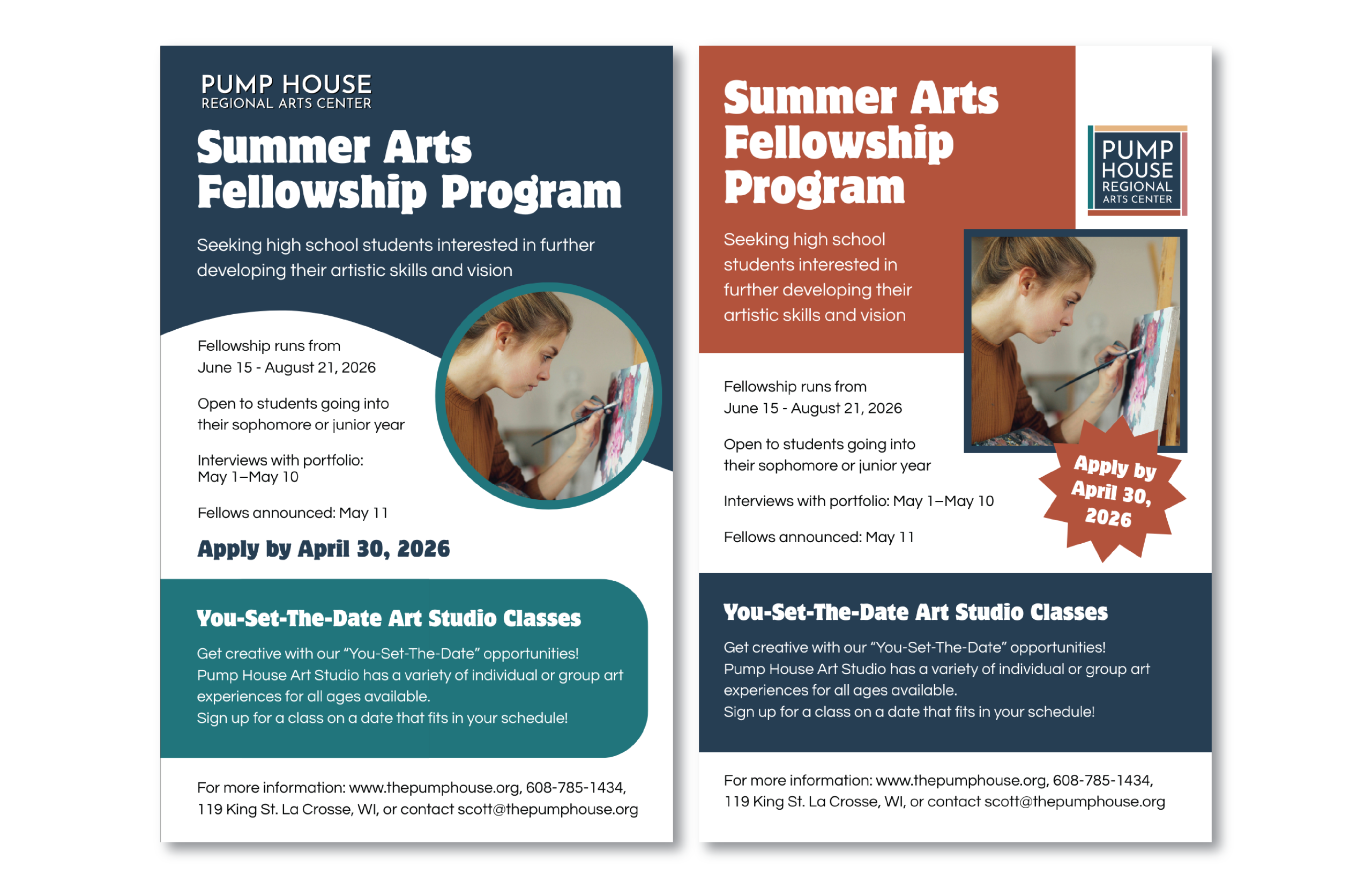
I was tasked with creating a flyer for Pump House’s summer arts fellowship program. The flyer had to be 8.5 x 5.5″, use Pump House’s color palette and logo, and convey information about the fellowship program in a succinct manner.
I created two different versions of the flyer on Canva (Pump House’s preferred design platform), and after a round of critiques, the blue flyer on the left was chosen for distribution.
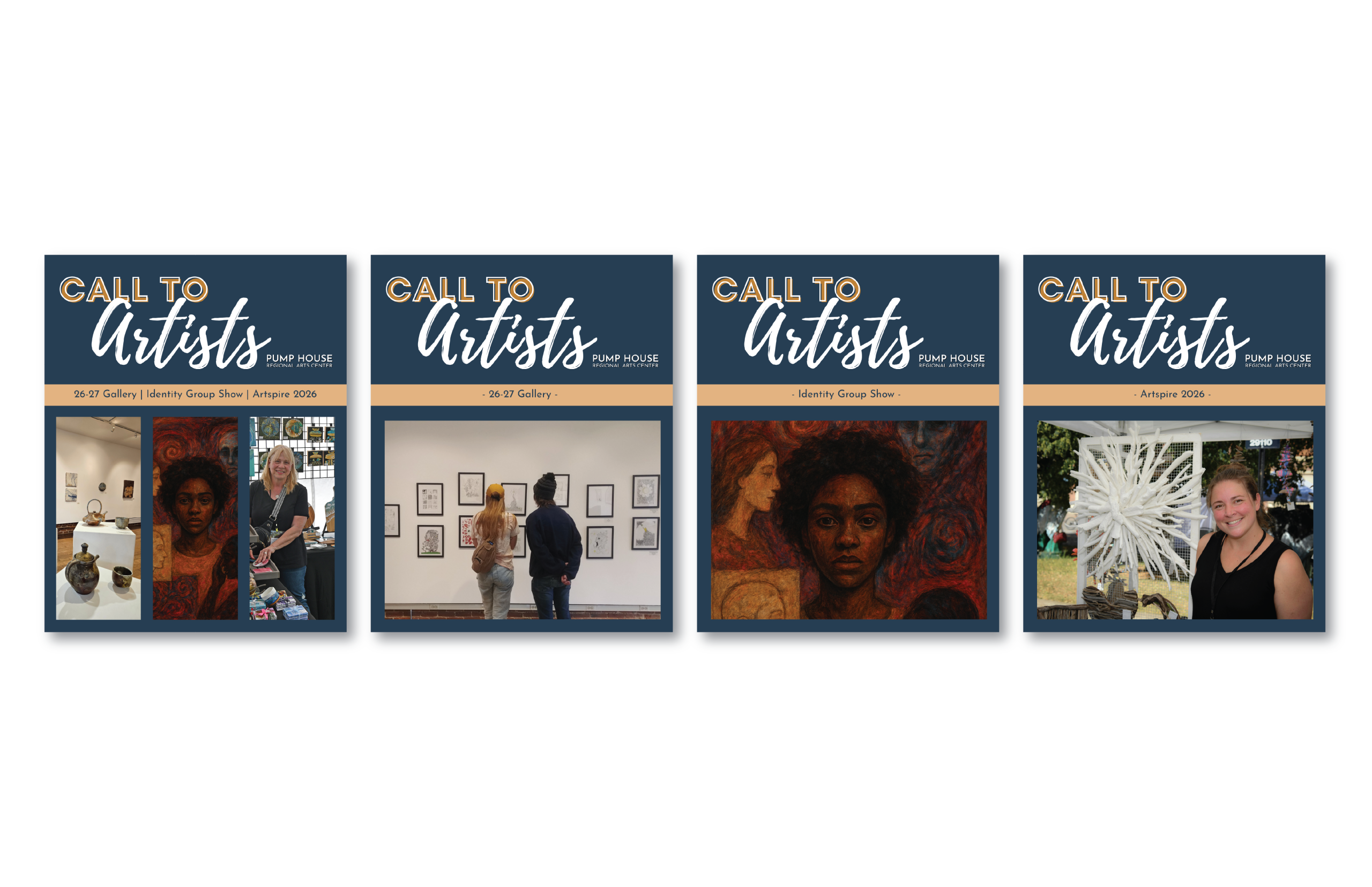
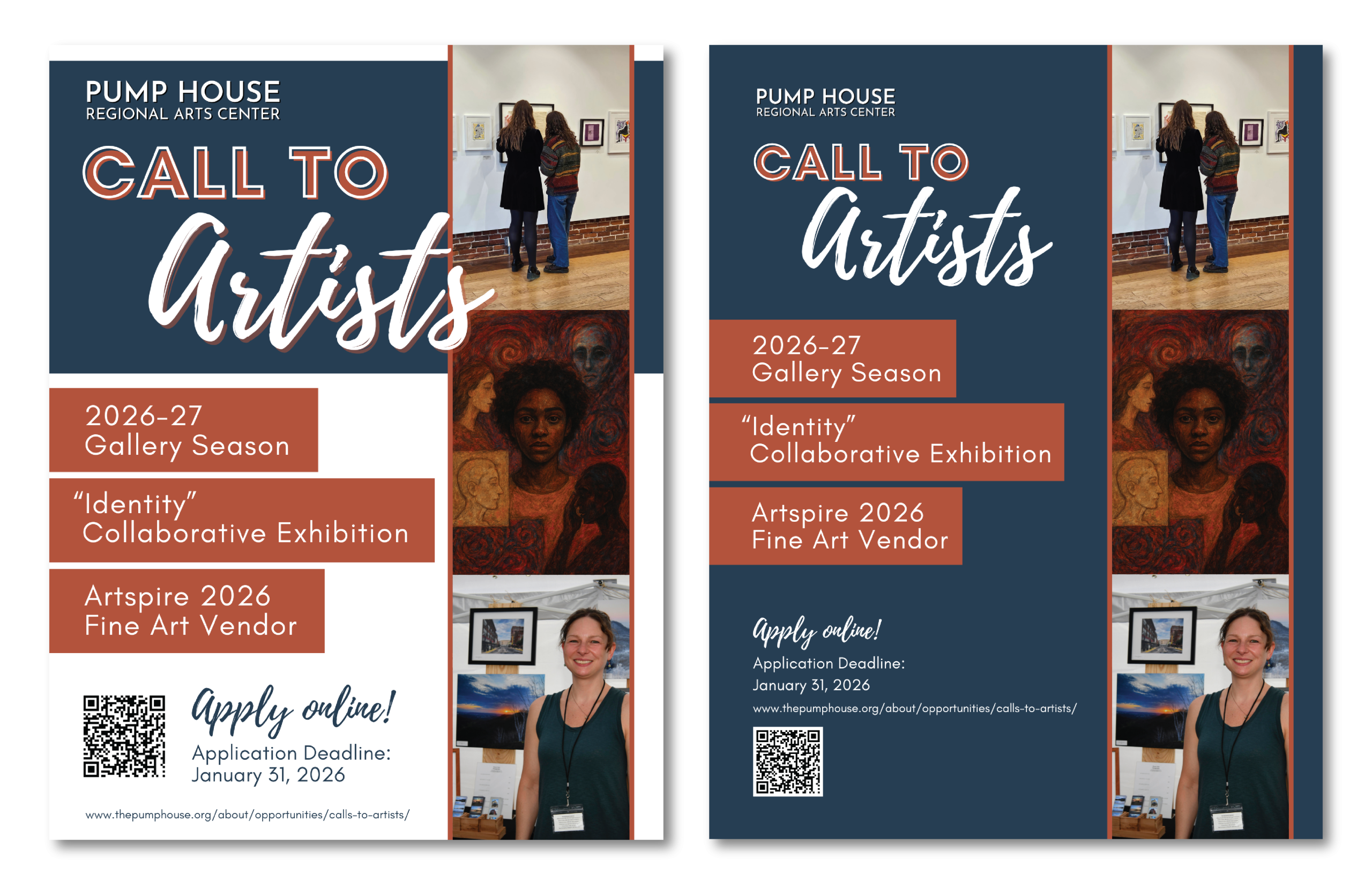
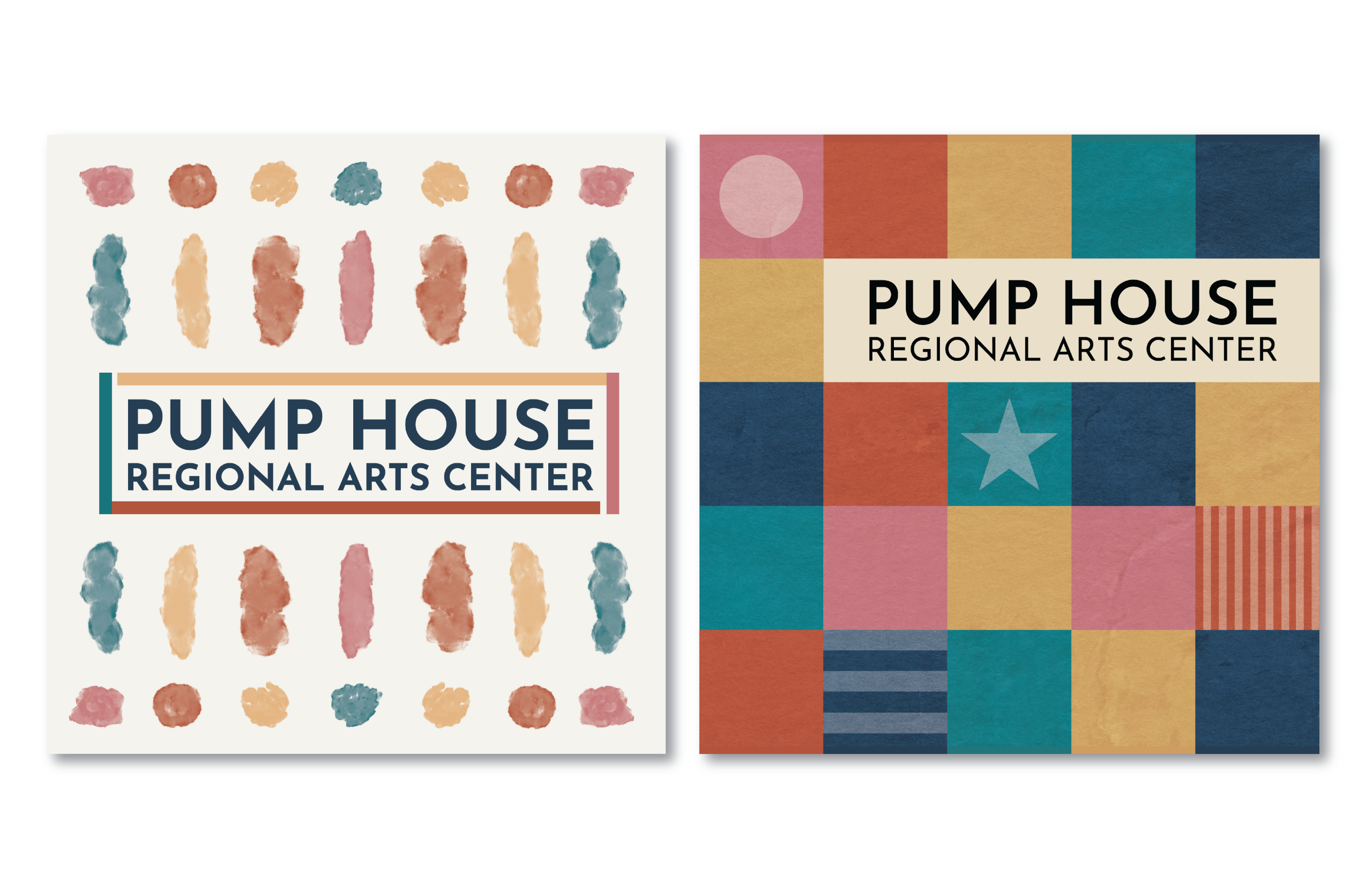
The first slide is a collection of social media graphics that I posted on Pump House’s Instagram and Facebook accounts to promote the 2026 Call to Artists. The second slide is two flyers I designed for the same purpose. I utilized repeated colors, fonts, and rectangular shapes to unify the social media posts and flyers, so community members would recognize them as promoting the same event.
All the social media graphics were posted online, and the white flyer on the left was used for advertising.
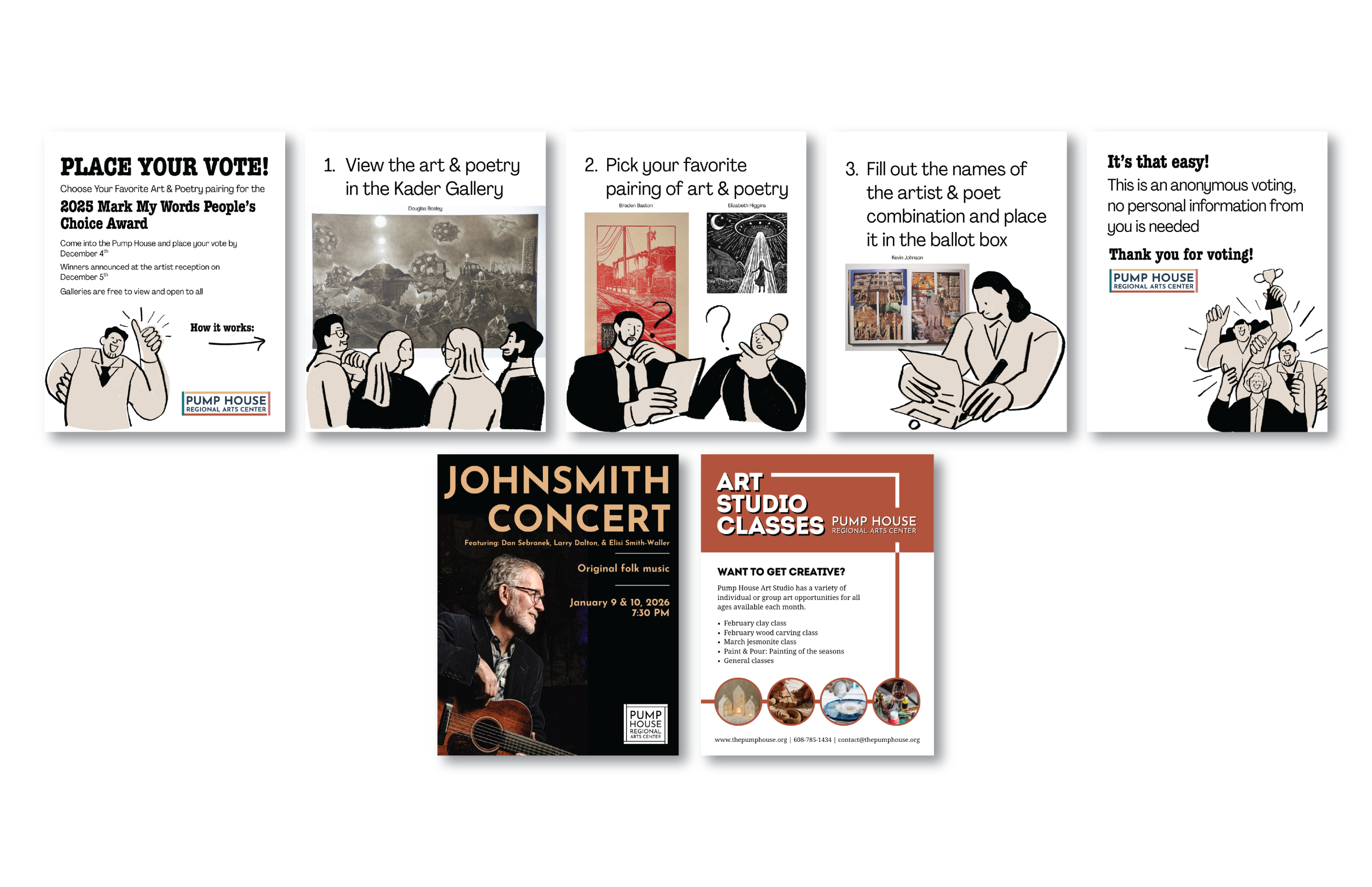
My task was to design a social media post that demonstrated how to vote for the Mark My Words people’s choice award. I created the top row of social media graphics to be posted as a slideshow. I made the choice to add cartoons to keep social media viewers engaged, and I used the artwork from the competition to catch the interest of possible visitors. Because of the tight deadline I had to create the graphics, I found royalty free cartoons to use. The slideshow was posted on Pump House’s Instagram and Facebook pages.
The second row is other social media graphics I made. For the Johnsmith Concert graphic I chose to use a photograph of him looking to his right, so the viewer’s attention would be directed to the concert information. I made sure that Johnsmith’s guitar was shown in the design, to convey what kind of music was going to be played at the concert.
The last social media graphic was made to advertise the art classes Pump House hosts. I was provided with the text and images. I intentionally combined hard-edged rectangles with soft circles to break up any monotony and keep the views interested. I made sure to prominently display the logo and the Pump House’s orange brand color so possible customers would know who was hosting the classes.
These stickers were created with the intention of handing them out to college students and advertising Pump House to young people who are new to the La Crosse area. I took sketches made by a Pump House staff member and further developed them into the final stickers; using my knowledge of trending stickers to make the appeal to a college audience. Both designs were sent to print.